
Optic Overload: Why Bridget Riley’s Trippy Stripes Are Big Money Art Hype Right Now
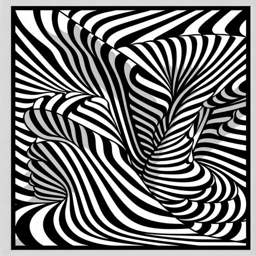
Stand in front of a Bridget Riley and your visual cortex starts doing backflips. Lines quiver like a dodgy frame-rate, colors throb like a shader effect, and the whole surface seems to lurch forward as if parallax were suddenly turned on in real life. It’s the uncanny “is this moving?” moment—only it’s paint, not pixels.
Riley’s mastery is ruthless minimalism tuned for maximum impact: black-and-white waves that hum, serrated zigzags that cut, and chromatic fields that ramp up like a heat haze. On a small screen her work looks composed, almost serene; at full scale it detonates. Think visual design you can feel in your balance sensor—no headset required.
The original optical engineer
Op Art can look disarmingly simple, which is why the classic jab—“could a kid do this?”—still pops up. In reality, Riley’s process is closer to building a game engine than doodling. She develops studies with surgical precision, mapping micro-adjustments in angle, spacing, and hue that determine whether a surface purrs or stutters. The final canvases, often executed with studio assistance, demand absolute accuracy; one misaligned edge and the illusion collapses. The clean geometry hides complex perceptual math.
Why this aesthetic feels so now
Riley’s language—crisp, graphic, and trippy—slots neatly into a world trained by UI grids, motion graphics, and high-contrast displays. Her patterns spark moiré on digital cameras, jitter against pixel arrays, and mess with your peripheral vision the way certain VR scenes do when the brain argues with the eye. It’s design-forward and hyper-photogenic, but never merely decorative; her work is a live test bench for how we see.
Hits to know (no spoiler names required)
- Monochrome waves: undulating bands that simulate drift and swell, like a visual undertow.
- Chevrons and diagonals: knife-sharp angles that set off phantom motion and optical flicker.
- Color stripes: high-key chroma sequences that feel like temperature shifts across your retina.
- Curvilinear grids: soft arcs that arc harder the longer you look, as if the canvas were breathing.
When the market turns its head—and can’t look away
Riley isn’t trendy ephemera; she’s a cornerstone of post-war abstraction with decades of institutional backing. At the top end, prime canvases—especially significant 1960s works and large, museum-caliber color paintings—command serious six- and seven-figure results at auction. Works on paper and prints sit at more accessible (if still grown-up) levels and often act as on-ramps for new collectors. The through line is stability: sustained demand, global visibility, and a collector base that treats her as mandatory viewing in any serious collection.
If you’re thinking strategy, two basics apply. First, period and scale matter: early monochromes and monumental color compositions tend to be the benchmarks. Second, provenance and condition are non-negotiable; with optical precision, even tiny surface issues can dull the effect. None of this is hype—it’s the slow-burn reality of a career that’s been pressure-tested across generations.
How to look (and why you need to)
Photos flatten what Riley really does, the way a screenshot flattens a VR level. You have to move. Approach from the side, slide laterally, then step in and out. The painting recalibrates with your position, producing a soft pulse one moment and a high-frequency shimmer the next. Your brain tries to negotiate edge contrast, color interaction, and micro misregistrations—exactly the sort of perceptual tug-of-war that game designers use when they choreograph depth and motion without actually animating anything.
Hype versus canon? Both.
Riley’s work has the instant-hit factor—clean, bold, impossible to scroll past—and the long tail of a verified classic. Designers quote her rhythms, architects echo her grids, and image-makers borrow her tricks to suggest speed inside stillness. Yet the aura isn’t borrowed shine; it’s earned. Decade after decade, museums stage her works to demonstrate a core truth of modern art: you don’t need a narrative to be transported. Sometimes a line is not a line; it’s an accelerant.
For the curious and the collecting
- New to the field? Works on paper and editions can be strong entry points while you study the visual grammar.
- Leveling up? Pay attention to period, scale, and the specific optical “engine” each composition runs—some ripple, others throb, a few feel like they spin.
- Visiting a show? Give yourself time. These pieces reward sustained looking more than any quick snap ever will.
Bottom line: Bridget Riley builds illusions that behave like living code written in color and line. The canvases are quiet; the experience is anything but. If you want art that reads sleek in a penthouse but detonates like a strobe in your head, she’s non-negotiable—must-see for the eye, must-know for the brain, and for many collectors, a must-have.