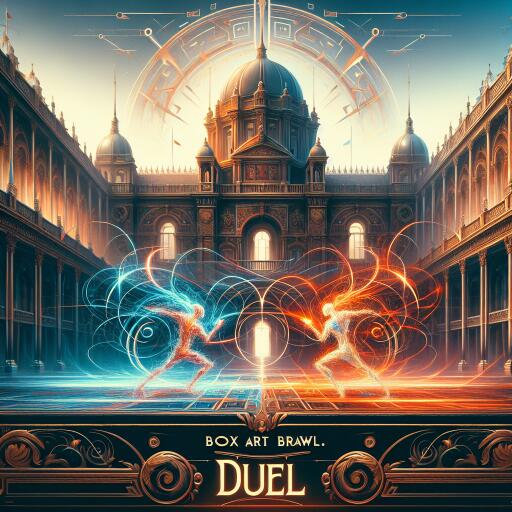
Poll: Box Art Brawl: Duel – Mendel Palace
Sharpen those aesthetic instincts—it’s time for another head-to-head dust-up of classic cover art. This week, we’re flipping back to the NES era with Mendel Palace, the quirky tile-tossing puzzler that just popped up on the Nintendo Switch Online service. Even if the title isn’t immediately familiar, its pedigree might be: this was the first commercial release from the studio that would later craft Pokémon.
Before we dive in, a quick nod to the previous duel: the western sleeve for a certain star-hopping GameCube shooter cruised to victory, collecting roughly two-thirds of the votes against its moodier Japanese counterpart. With that momentum, let’s see if the West can keep its streak—or if Japan turns the tiles this time.
The contenders
North America
The North American artwork goes loud, lively, and unmistakably late-’80s. A checkerboard of floor tiles pops with bold colors, while an energetic protagonist mid-flip sends slabs careening into a crowd of doll-like foes. The layout screams movement: diagonal lines, motion trails, and characters tumbling in exaggerated poses sell the game’s kinetic tile-flipping hook at a glance. Typography leans chunky and clean, with the title sitting confidently at the top, easy to read even from across a store shelf. It’s playful chaos—busy in the best way—meant to grab your eye first and ask questions later.
Design-wise, it’s a maximalist pitch to action fans. The color saturation and expressive faces push the “anything can happen” vibe, while the composition centers on the mechanical core: tiles flipping, enemies reacting, the board alive underfoot. If you grew up in the NES aisle squinting at boxes to figure out what a game actually was, this cover attempts to do the explaining for you—loudly.
Japan (Quinty)
The Japanese Famicom sleeve for Quinty takes a different route: character-first charm over raw spectacle. It’s an inviting, manga-flavored ensemble piece—rounder linework, pastel-friendly palette, and a clean arrangement that spotlights the cast’s personalities. The tile board is present but less explosive; the composition gives breathing room to expressions and poses, suggesting whimsy and puzzle-forward play rather than frenetic combat. The logo treatment is playful, curvy, and integrated into the illustration with a light touch.
Where the western art is all crescendos, the Japanese cover hums a cheerful melody. It trades velocity for vibe, letting the game’s dreamlike setting and toy-box antagonists radiate through softer tones and tidy framing. If you’re drawn to covers that feel like a page from a Saturday morning comic, this one’s your pick.
Which cover flips your vote?
Two philosophies, one game. Do you favor the high-energy promise of tiles flying and dolls scattering, or the warm, character-driven calm that teases a whimsical puzzle adventure? Consider composition, color, typography, and the story each sleeve tells at a glance—then make the call.
- North America: Big motion, bold colors, and an instant read on the core mechanic.
- Japan (Quinty): Character charm, softer palette, and a tidy, manga-inspired presentation.
Cast your vote in the poll below and tell us why in the comments—does your pick best capture Mendel Palace’s flip-happy spirit, or simply look cooler on a shelf?
A quick flip through the game itself
For anyone discovering it fresh: Mendel Palace is a tile-flipping action puzzler set across themed “dream” rooms packed with toy-like adversaries. You don’t jump or attack in the traditional sense; instead, you shove the floor itself, sending tiles sliding to stun, shove, or trap foes. It’s snappy, deceptively tactical, and tailor-made for short bursts. That core mechanic informs both covers: one treats it like a pinball table about to tilt; the other like a storybook playground where the floor is a toy.
Whichever regional art wins, it’s fun to see how two approaches can sell the same idea: the board is your weapon, and the world is just a flip away from chaos—or delight.
Your turn
Vote, discuss, and reminisce about which box you’d have begged for back in the day. And if you’ve been playing the newly added version, let us know whether the cover you chose matches the mood you get on the screen. Happy brawling!